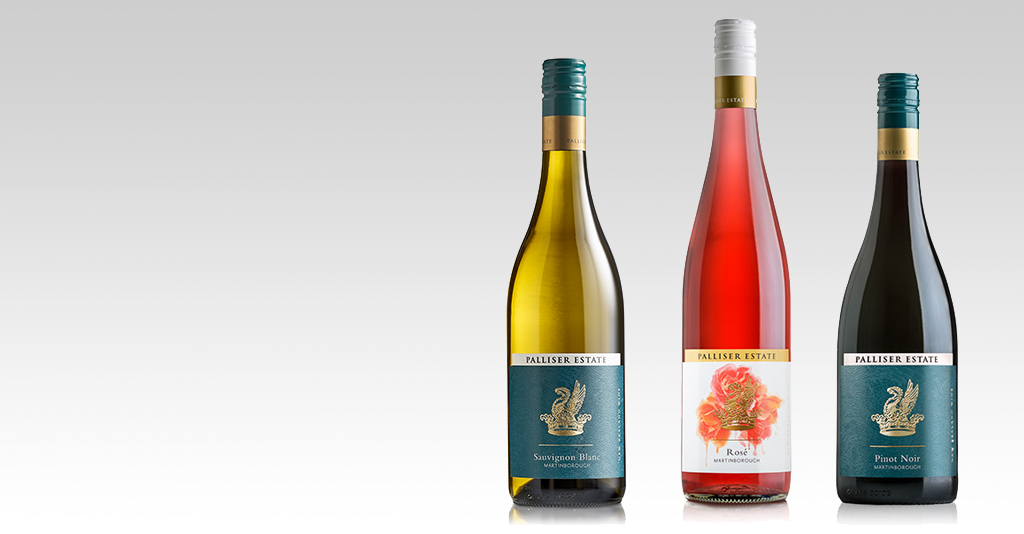
There have been some exciting changes at Palliser over the last year with a repositioning of the brand. One part of this has been the evolution of its wine packaging to ensure the visual brand reflects the quality of the wine. The new Estate range label has now been launched for all the 2016 whites, the 2016 Rosé and the 2015 Pinot Noir.
The new label is an enhancement of the old label, with a focus on the elements that make Palliser stand apart. Its story, iconic Griffin and distinct colours of gold, black and deep teal (reflecting the colour of the New Zealand ocean and in particular Palliser Bay). Palliser wanted to celebrate the prestige of past and present pioneers by being unashamedly old school but with a sharp, contemporary edge.
The Palliser brand story is the idea of exploration. Palliser Bay was named by James Cook in honour of his patron Admiral Palliser, who was a great advocate of exploration in the age of discovery. In the background of the new label is the ocean scape to pay homage to this. The name Palliser captures the essence of the region’s history and the legendary explorers who discovered New Zealand. We wanted the label to reflect this.
Palliser’s Griffin crest is iconic and has been made more significant in the new branding, to ensure it is instantly recognisable and synonymous with the great estate. There have been some minor refinements to add a sense of craftsmanship, prestige and substance to the image.
The new Rosé label has strong ties to the Estate range but with a more fun, fresh feel. The white and gold label is elegant with splashes of colour. The beautiful rose imagery makes the label speak more vivaciously of the variety while adding an air of sophisticated femininity into the brand.
Palliser has been pleased with the positive feedback to date and is looking forward to the evolution of the Palliser story and continuing to build on its proud heritage – both in and out of the bottle!
Pip Goodwin
Palliser Estate - Chief Executive Officer
